Tuesday, September 24, 2013

It's a dirty job


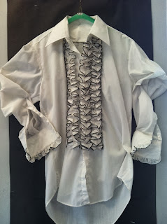
Mike Rowe would agree: it's a dirty job. Reverse charcoal drawings, that is. Last week my honors studio art class began to cover their paper (and themselves) with charcoal. This drawing technique creates a dramatic effect and accentuates lights and darks in the drawing. The stubject matter is a bit of a challenge as well. I selected a 1970's style tuxedo men's shirt that is now pinned to the wall. (Below)


Students then began to sketch out the shirt in 3 different compositions. Even the thumbnail sketches make an interesting layout. Just look at Jennifer Palazola's sketches below.


Once the student had decided on the most successful composition, they began to use an eraser to draw that sketch on their prepared charcoal paper. The majority of this drawing is done with an eraser, charcoal and some white and grey tone pastels. Take a look at the beginning. 


I am looking to showing you the finished products!


Even clean up is more interesting when we are using charcoal! 


Wednesday, September 18, 2013

Drawing classes off to a good start

Marissa Lane

Cara Stockman

Megan Russo

Nicholas Lane hard at work sketching

E Block boys transferring their sketches to final drawings

Patsy MacDowell working on final drawing
My E block and B block drawing classes are off to a terrific start with the iconic "CHAIRS" project. As posted before, this project is the first drawing lesson on line and space. Our students learn the vocabulary terms listed below before we get started with three thumbnail sketches of our subject matter: chairs. As you can see from the pictures posted above, our students really did a nice job at setting up an interesting composition with such a simple subject matter. Students then transferred their sketches to their final drawing paper and decided which compositions worked better for postive space and negative space.

We then talked about various qualities of line and pen strokes. What emotional association does a zig zag line have? A wavy line? We talked about pattern in pen strokes and how pattern can create movement and texture. We looked a several works of art that showed us examples of pattern as texture and line has texture and movement. We then began to explore line as pattern and zentagles. Zentagles by definition is: a drawing using structured patterns. We practiced pen strokes and zentagles in our sketcbooks before using them on our final pieces. I will post pictures of our finished products when they are handed in next week.

Composition: The arrangement of elements such as line, value and form within an artwork, princples of design are considered in order to achieve a successful composition.
Compositional Movement: A path that the viewers gaze is directed to follow because the arrangemnt of the elements in an artwork.
Positive Space: The areas containing the subject matter of the artwork. Also referred to as figure.
Negative Space: The areas of a work of art not occupied by the subject matter, but which contribute to the composition. Also referred to as ground.
Figure/Ground Ambiguity: exsits when it is impossible to determine what would be considered figure and what would be considered ground in a work of art.
 **SPARKLE WORD**
Ambigious: Open to more than one interpretaion. Having a double meaning. Unclear.


Tuesday, September 10, 2013

Welcome the birth of 2 new courses!

Here we are again back to another great year of making an exploring art. I am looking forward to teaching two new classes to GHS this year. Studio Art 1 and Studio Art 2 were added as part of a track for students who are interested in becoming serious about art as a possible career choice. Although Studio Art 1 was an intended freshman level course I am pleased to see that many students have tried the course as an introduction to different mediums in art. I am looking forward to seeing the course develop as we investigate new artists, movements, mediums and techniques.

Studio Art 2 is our first course that was tracked for a full year. The intent of this course was for sophomores, or students who have had some type of art background, be it drawing, painting, photography or 3D works; to work on a full year of developing their visual voice. Many students that signed up for this year long course are new to art so I have decided to start with our basic introductory level of elements and principles of design. Our first project will be to incorporate at least 3 elements and 3 principles into a work of art that is a physical and artistic representation of YOU the ARTIST. We will draw on inspiration from some fashion illustrations with use of mixed media being we have a variety of skill level at this early point with drawing.
See the examples below for our inspiration.


These examples are from students that attend the University of Westminster who have taken a course in Fashion Illustration.

I am looking forward to seeing what our students come up with as they construct their artistic inner self. I will be sure to post the finished products by the end of September!

I also would like to add that our HONORS Studio Art Class has made a comeback this year after having a long hiatus from GHS. I am really excited about this class as it will be a rigorous course in self examination, mastering technique and a prerequisite for an AP level Studio Art class that will arrive at GHS in the near future. 

Once again, I am really excited about the beginning of the school year and start of a new journey!